
The bitcoin logo is so popular that Google even added it to the keyboard character set. At the same time, unlike many well-known logos, there are no marketing teams, eminent designers and millions of dollars behind its creation.
Who created the first bitcoin logo? Why was the first version changed? What is the secret symbolism of the cryptocurrency logo? We will talk about everything in detail in this article!
The First Bitcoin’s Logo: Digital Gold
The idea of creating a digital currency has been actively discussed since the 80s of the twentieth century. Specialists were attracted by the idea of anonymity and speed of such payments. Since then, several cryptocurrency prototypes have been launched, but it was not until the early 2000s that the idea was fully put into practice.
At the height of the financial crisis in August 2008, the domain bitcoin.org was anonymously registered on the Internet. And in October, an article, ‘Bitcoin: A Peer-to-Peer Electronic Cash System’ by the authorship of certain Satoshi Nakamoto, appeared on the website metzdowd.com, dedicated to cryptography. The article, which later became known as the Bitcoin White Paper, outlined the idea of a new, decentralized digital currency and the principle of its operation.
Read Next: Who Is Satoshi Nakamoto: Everything You Need to Know
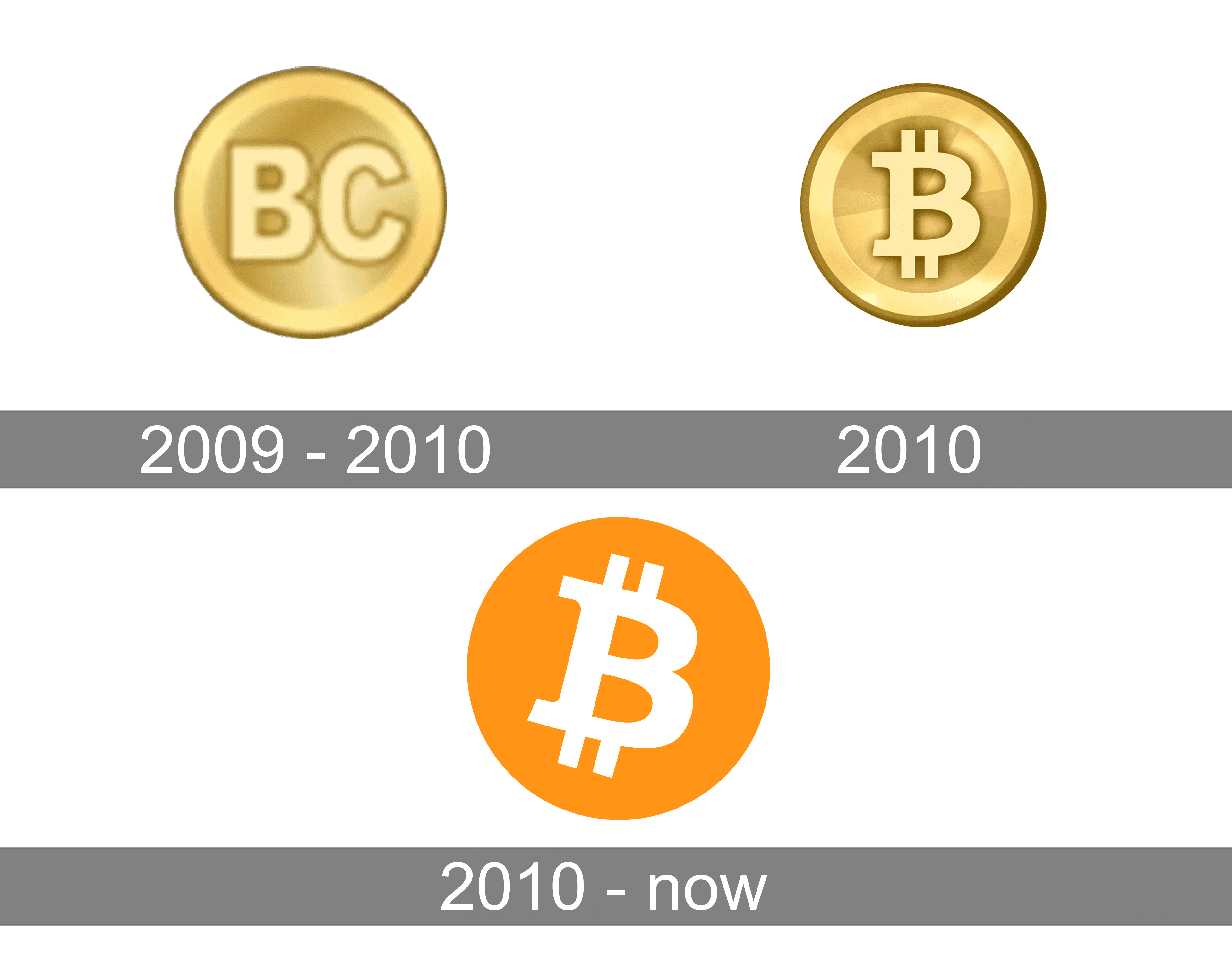
A few months later, in January 2009, Nakamoto introduced the first Bitcoin logo: a gold coin icon with the abbreviation ‘BC’ (short for ‘bitcoin’).
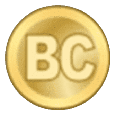
Designers believe that the first bitcoin logo was inspired by the popular skeuomorphism philosophy of the time. This is the name given to a design in which digital objects duplicate their physical counterparts (a famous example of such a design is the operating system on the first iPhone). In the case of bitcoin, the coin was supposed to resemble real money, being associated with digital gold.
History of Bitcoin (BTC) Logo Changes
During the first two years of Bitcoin’s existence, its logo changed twice. The final version of the logo has been known for more than ten years and has become increasingly popular ever since.
First Bitcoin Design Update: Feb-2010
With the advent of the popular crypto forum Bitcoin Talk, users began to discuss, among other things, the improvement of the logo. Some suggested taking the Thai baht (฿) symbol as a basis, others suggested creating a unique icon from scratch, and still, others suggested using the three-letter bitcoin code (‘BTC’) in the icon.
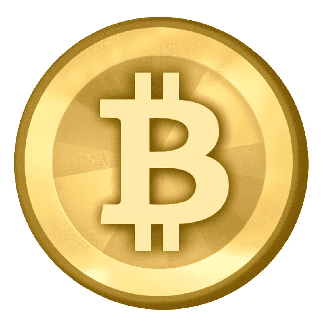
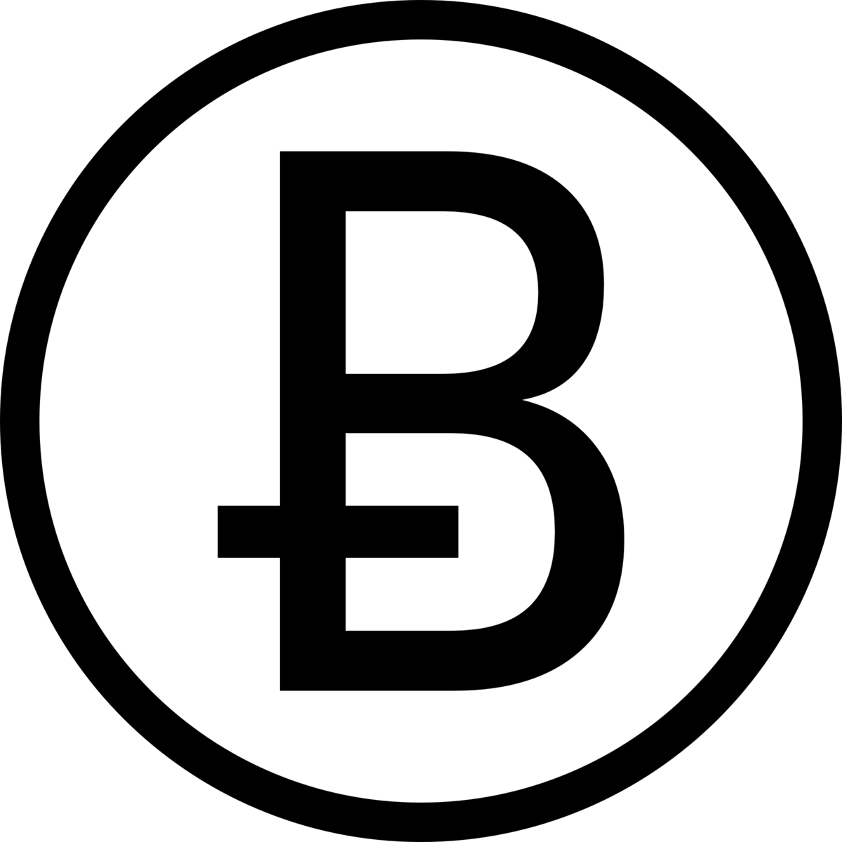
In February 2010, Satoshi presented his vision for the updated logo. Keeping the gold coin, he replaced the abbreviation ‘BC’ with the letter ‘B’. It was pierced by two vertical stripes, reminiscent of the symbols of traditional currencies.
Second Bitcoin Design Update: Nov-2010
The forum participants were not satisfied with the changes, and in November 2010, a user under the nickname Bitboy published his own version of the bitcoin logo in a flat design style. He tilted the white ‘B’ to the right, keeping two strokes above and below, and placed it in the orange circle.
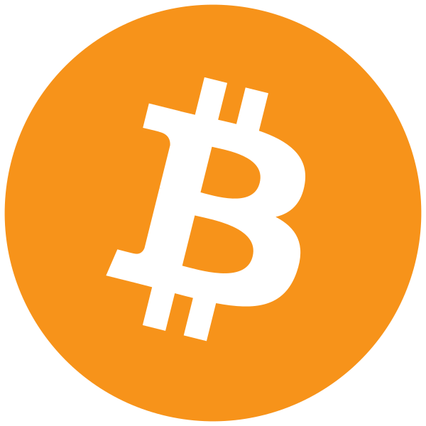
The logo began to look more concise and modern, which was appreciated by users of the Bitcoin Talk forum. ‘The best bitcoin logo I have ever seen,’ commented one of the forum participants.
Alternative Version of the Bitcoin Logo: Apr-2014
Despite the successful redesign, an activist group called the Bitcoin Symbol insisted that the digital currency needed not a logo but its own sign. Their arguments were as follows:
-
- Bitcoin is not a brand, but a currency, so it does not need a logo but a symbol (like $, €, or ¥).
-
- Like other currencies, it is suitable for a Unicode character that can be easily printed in different fonts on different devices: a graphic logo does not have such properties.
In April 2014, activists proposed the letter ‘Ƀ’, which appears in some alphabets, as a new symbol. And although several bitcoin startups began to use this symbol, it has not found wide application.
Over time, the Bitcoin symbol movement lost its relevance as the bitcoin icon became self-sufficient, popular and recognizable. So much so that Google has added the bitcoin symbol to the keyboard (albeit only for iOS users), and Twitter has introduced it as an emoji to complement the #bitcoin hashtag.
Bitcoin Logo Elements: Symbolism Behind BTC Logo
A few years after the creation of the logo, Phil Wilson, who claims that he was hiding under the nickname Bitboy, published an article detailing the symbolism of the original bitcoin logo.

Shape
Before choosing a circle, Phil Wilson studied the psychology of shapes. One of the options was a square or a zigzag since corners attract attention faster: since primitive times, the human brain, first of all, has noticed the movement associated with danger.
But as a result, Wilson decided that associating bitcoin with negative feelings was not the best choice and dwelled on the circle. This shape is:
-
- more warm and friendly;
-
- continuous, just like bitcoin;
-
- symbolic: two circles side by side turn into a symbol of infinity;
-
- reminiscent of the traditional form of a coin.
In addition, back in 2010, on the BitcoinTalk forum, Bitboy admitted that he was inspired by the design of Visa and Mastercard:
The irony is as much as I hate Mxxxxx and Vxxx, it is all about perception when it comes to consumer confidence and behaviour.
Letter ‘B’
This is not just the first letter in the word ‘bitcoin’ — if it is turned on its side, it will look like the number 8. The number has become symbolic for the logo design:
-
- The size of each block in the bitcoin logo design is proportional to 12.5 (100 divided by 8).
-
- The slope of the letter ‘B’ is 14 degrees. This number was obtained through complex mathematical calculations based on 12.5. The slope symbolizes a blockchain, which moves endlessly into the future.
Vertical Lines
A characteristic feature of the dollar sign ($) is a vertical line that runs through it from top to bottom. A similar technique is used in the bitcoin logo. True, with a completely new meaning:
-
- Wilson drew not one, but two vertical lines, in a way how ‘$’ was depicted in the Disney comics about Scrooge McDuck.
-
- The lines are thinner than the other lines in the letter ‘B’ and appear only above and below it: it seems that the ‘B’ crushed the ‘$’ and slammed it into the ground. In other words, the bitcoin logo symbolizes that the digital currency is replacing the traditional one.
Font
The ‘B’ is made in Trebuchet — Wilson admits he’s always loved the word and its use in Microsoft’s Age of Empires game. In addition, the sans-serif font is suitable for digital use.
In addition to the symbol, the full version of the logo features the word ‘bitcoin’ written in black lowercase sans-serif letters. This is the Ubuntu Bold Italic font, created specifically for the Ubuntu project, a free and open-source software.
The minimalistic and modern font conveys the key characteristics of Ubuntu, which are inherent in Bitcoin: accuracy, reliability and freedom.
Colours
The main colour of the Bitcoin logo is orange. Here is how Wilson explains his choice:
-
- Technical requirements. Colour had to be displayed well both on websites and in print media. Therefore, Wilson turned to the CMYK scheme, which is used in printing.
-
- Functionality. A logo had to be visible from a distance, easy to remember and reproduced. Orange coped with this task best of all in comparison with other shades.
-
- Psychological perception. The shade chosen is very close to the typical safe orange that many people are used to. In addition, it is associated with gold.
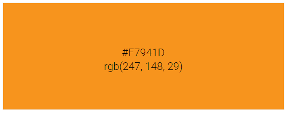
The orange colour in the logo is complemented by white and black. The letter ‘B’ is painted in white, and the inscription ‘bitcoin’ is painted in black. They create contrast, maintain a minimalist style and are associated with nobility, authority, and value.
Copyright for the Bitcoin (BTC) Logo
The official bitcoin logo is protected by a Creative Commons license. This means it can be freely used for commercial and non-commercial projects.
A recent study found that of the top 500 recent CoinMarketCap logos, 13% imitated the bitcoin symbol, using initial letters slashed with lines or spaces.
Conclusion
Today, the bitcoin logo is one of the most recognizable in the blockchain world. Let’s summarize what made it so:
-
- Conciseness. The simpler and cleaner the design, the better it copes with its tasks: instant reading of meanings and recognition.
-
- Uniqueness. Although the logo is reminiscent of the symbols of traditional currencies, it is completely different from them, which makes it self-sufficient and easy to remember.
-
- Versatility. When zoomed and reduced, the image remains high-quality in digital and printed form.
-
- Timelessness. Although the logo celebrates 12 years today, it has not lost its relevance due to its minimalistic design and accurate conveyance of meanings.
Happy Bitcoin Logo Day!
Leave a Reply